
SuppLink
A B2B mobile app that connects retail shop owners directly with their suppliers, giving them real-time stock and pricing, direct ordering, and full visibility on every delivery.
Process
UX Strategy, UX Research, UI Design, Information Architecture, User Testing
Role
Sole Designer
Tools
Figma, Miro, FigJam
Timeline
3 months, 2024
Context
I worked in this industry. I saw the losses. Then I designed the fix.
I didn't find this problem in a design brief. I lived it. Working inside this industry, I watched shop owners reorder items they'd already received because the first call went unconfirmed. I watched supplier staff write down orders by hand and still get them wrong by delivery. The loss wasn't dramatic, it was quiet, repetitive, and happened every week. That's what made it worth solving properly.

THE PROBLEM
The ordering process between retailers and suppliers ran entirely through phone calls; calls that could be misheard, missed, or forgotten. There was no shared record. No real-time visibility. No accountability when something went wrong.
How might we remove the phone call from the ordering process entirely, so both sides have a single confirmed, visible record of every transaction?
Research
This wasn't research from a distance. The problem sits on both sides of every bad order.
I already understood the frustration personally, so instead of starting with assumptions, I went back to the field with specific questions: How often does an order go wrong? What do people do when it does? And crucially, who takes the blame? I spoke with retail shop owners and supplier marketing staff separately, so neither side could soften what they said in front of the other.
For shop owners, the same 4 problems came up in almost every conversation:
Order Mistakes
Orders placed incorrectly due to miscommunication.
Delivery Delays
Deliveries arriving late without any pre-notifications.
Lack of Real-Time Updates
No way to check stock or pricing without calling first.
Business Losses & Strained Relationships
Financial losses that quietly eroded margins over time.
On the other side of the counter, suppliers were fighting their own version of the same battle.
Errors from Marketing Staffs
When a marketing staff got an order wrong, it was the supplier's relationship, not just the staff's mistake and that took the hit.
Manual Order Taking
Orders were recorded by hand in notebooks.
Inefficient Price & Stock Updates
Every price change meant calling each retailer individually.

Key Insights
Three patterns emerged that shaped every design decision that followed.
I already understood the frustration personally, so instead of starting with assumptions, I went back to the field with specific questions: How often does an order go wrong? What do people do when it does? And crucially, who takes the blame? I spoke with retail shop owners and supplier marketing staff separately, so neither side could soften what they said in front of the other.
The phone call is the product.
Every workaround people described was just a substitute call. Improving the workarounds wasn't enough. The solution had to eliminate the dependency entirely.
Trust breaks at the handoff.
Most errors weren't discovered at delivery. They were set the moment an order was verbally relayed. By the time the wrong item arrived, accountability had already dissolved. The design needed a confirmed record at the moment of ordering.
Suppliers needed this too.
Every existing app was built for retailers only. But suppliers were drowning in the same chaos from the other side: manual notebooks, one-by-one price calls, and no structured incoming orders. A solution that only helped retailers would still fail.
Creating Personas
Two personas, built from real conversations.
I already understood the frustration personally, so instead of starting with assumptions, I went back to the field with specific questions: How often does an order go wrong? What do people do when it does? And crucially, who takes the blame? I spoke with retail shop owners and supplier marketing staff separately, so neither side could soften what they said in front of the other.

Corner-store Chaw Chaw
Small Convenience Store Owner
“Sometimes I don’t even know if my order went through until the delivery shows up or doesn’t.”
Pain Points
Workarounds
Prices often changes without notice.
Keeps a notebook of past prices and calls multiple suppliers.
Orders get delayed or missed, and there’s no proper confirmation.
Follows up with voice calls or sends reminder messages after every order.
Difficult to find new or alternative products when existing ones go out of stock.
Asks around in her small business group chats or waits for supplier reps to visit.


Local Supplier Ko Min
Beverage Distributor
"I always worry that one wrong delivery could damage the trust I’ve built with my customers."
Pain Points
Workarounds
Orders come from too many channels and are hard to keep track of.
Writes down manually on his notebooks.
Retailers often miss price updates or stock changes.
Sends updates manually through group messages or one-on-one chats.
Incorrect items are delivered to retailers.
Tries to confirm each order with a follow-up call

Competitor Analysis
Retailers were still managing each supplier relationship separately.
Every app I tested required company approval before a retailer could place an order, adding a step rather than removing one. More critically, none allowed ordering from multiple suppliers in one session.
The gap no one had filled. All suppliers in one place. Direct ordering with no approval gate. Real-time stock and pricing across all of them simultaneously. That is what SuppLink is built to be.
Sketching & Wireframing
Two decisions came out of the paper sketching that shaped the entire app structure.
First, early sketches had a separate 'new order' button on every screen, but on paper, it became clear that shop owners always start from a supplier, not from a blank order form. So the flow begins from the supplier catalog, not a cart.
Second, the connection step: linking a shop to a supplier, was initially a multi-screen flow with a search field and manual lookup. Sketching it revealed that a single outlet code entry was faster and more trustworthy than search, because it mirrors how suppliers already identify their clients.


Once the paper sketches confirmed the flow structure, I moved to wireframes to stress-test the information hierarchy before touching any visual decisions.

Information Architecture
Mapping where everything needs to be before building a single screen.
Before moving to high-fidelity design, I mapped the full information architecture. It kept the structure clear during design and made sure no important flow was missing or buried too deep to find.

Userflow
Full journey from registration to tracking order.
Mapping this in full before building helped identify where drop-offs could happen and where the flow needed to be tightened.

The Design Solution - how each feature resolves a specific failure
Every feature in SuppLink maps back to a specific failure point from the research.
A unique outlet code as the key for making any action.
Shop Owner:
Chaw Chaw registers her shop and receives a unique outlet code, her permanent identity on the platform, which becomes her key to connecting with any supplier on the platform.
Supplier:
On the supplier side, Ko Min's catalog is already live and waiting. The moment she's verified, the connection between them is just one code away.


Connect directly, no waiting for a salesperson to add her.
Shop Owner:
Using her outlet code, Chaw Chaw links directly with the supplier: Ko Min's account. A green checkmark confirms the connection has succeeded and can start ordering.
Supplier:
For Ko Min, a new verified retailer just joined his network without a single cold call or in-person visit from his team.


Explore suppliers and products, and what is actually available.
Shop Owner:
Once she connects, Chaw Chaw explores suppliers and their full product catalog with live stock and pricing. She's not calling to check; she can see it now.
Supplier:
For Ko Min, this means his inventory speaks for itself. No salesperson needs to visit Chaw Chaw's shop to show her what's in stock this week.


Place orders from multiple suppliers at the same time.
Shop Owner:
She can order from several connected suppliers in a single session, without switching apps or making separate calls for each one.
Supplier:
The order lands directly with Ko Min in a structured, clear, and confirmed. No relay through marketing staff. No handwritten notebook entry. What she ordered is exactly what he sees.


Check the item detail, and there is no more guessing what's in the box.
Shop Owner:
Chaw Chaw checks item details: descriptions, images, and unit sizes, before adding anything to her cart.
Supplier:
For Ko Min, fewer unknowns on the retailer's end means fewer disputes when the delivery arrives.


Track order status and know what's happening in every step.
Shop Owner:
Once an order is placed, she can track its status in real time: in progress, cancelled, or delivered for every supplier. No more waiting and wondering.
Supplier:
Ko Min updates the status on his end as it moves through his operation. Both sides always know where things stand, without a single follow-up call between them.


Measurable Metric
"Did it work?".
I ran usability testing with 8 participants: 5 retail shop owners and 3 supplier marketing staffs.
Every task was observed without guidance, and I tracked error rate, task completion, SUS score, and NPS.
Recruiting participants wasn't a challenge for me. I was already in this business and I met marketing staff and suppliers every day.
NPS of 7.7
shows a strong likelihood of recommendation.
6 out of 8
reported clear satisfaction with the order flow and supplier connection experience.
Average SUS score 79.5
fits well into "good" usability.
100%
completed both task flows with zero drop-offs.
BUSINESS VALUE
For shop owners
Real-time stock and pricing means no more calling around to check availability.
A direct connection to suppliers means orders go through without a middleman.
And full order tracking means Chaw Chaw always knows whether her delivery is coming before it shows up or doesn't.
For suppliers
Pricing updates go out automatically, no more calling every retailer individually.
Orders arrive directly through the platform, removing the manual notebook entirely.
And a growing connected dealer network means more sales without more staff.
Iterative design
Testing gave me clear direction. Missing user-focus information and 2 unhappy paths.
Hard to navigate "Add To Cart"
Participants couldn't find their cart after adding items. I had placed it in the menu bar, assuming it was a natural location, but when they were mid-browsing, they never looked there.
Before

After

Outcomes
What changed: I moved the cart to the top bar where their eye already was, and the confusion disappeared immediately.
Unhappy Path - The supplier browsing problem
Participants didn't want to navigate to a supplier's page just to browse their products. The existing flow required 3 steps: find supplier, tap in, then browse, which felt like too much work when they already knew what they wanted. What they actually wanted was to see supplier products grouped directly on the browsing page, without breaking their flow.
Before
Step 1: Go inside Suppliers.

Step 2: Tap Supplier.
Step 3: Browse items.
The decision - Should I do only one screen or both?
I got two options:
remove the product browsing on supplier screen, or
keep the original flow of the dedicated supplier screen, and surface supplier products inline on the browsing page.
I made decision to go with second option. Why? Retailers who know which supplier they want can go directly to that supplier's page. Retailers who are just browsing can see supplier-grouped products without leaving the main flow.
After
Tap Products.
Directly choose which supplier to order from.


Outcomes
What changed: Added supplier-grouped inline browsing selection dropdown in the product browsing page. This immediately reduces an extra 3 steps of clicking, and participants can navigate either way without backtracking.
Checkout summary: supplier information missing
The order summary listed every item clearly but showed no supplier context. During testing, participants with orders from multiple suppliers couldn't tell which items came from which supplier.
Before

After

Outcomes
What changed: Added a supplier label above each item group in the checkout summary. Participants stopped questioning the breakdown and moved through checkout without hesitation.
Item exploration: no source supplier visible on product cards
Items from different suppliers appeared in the same product listing with no indication of where each item came from. Participants making price comparisons couldn't evaluate their options confidently; the source name directly affects both pricing expectations and delivery trust.
Before
After

Outcomes
What changed: Added a supplier name label to each product card. Participants could immediately see who they were ordering from before committing. Hesitation during browsing dropped in the second testing round.
Takeaways
What I've learned
Starting from personal industry experience gave me a head start. I could ask sharper interview questions because I already understood the vocabulary. But that same familiarity created blind spots. I assumed certain things were obvious to users because they were obvious to me. Usability testing fixed that. The sessions reminded me that knowing a problem and designing for someone else who has it are two different skills, and both require the same rigour.
What I'd do differently
I spent more time validating the retailer-side flow than the supplier-side one. In a real product cycle, I would have run a dedicated supplier-only testing session to catch issues on that side before launch. The dual-user nature of this platform makes each side equally important to validate.
What comes next
Version 2 would explore a push notification strategy for price changes. Currently, suppliers update pricing in-app, but retailers have no active alert when a price they care about changes. I'd also explore a lightweight analytics view for suppliers: knowing which products retailers browse but don't order is valuable catalog data.
See Next Project
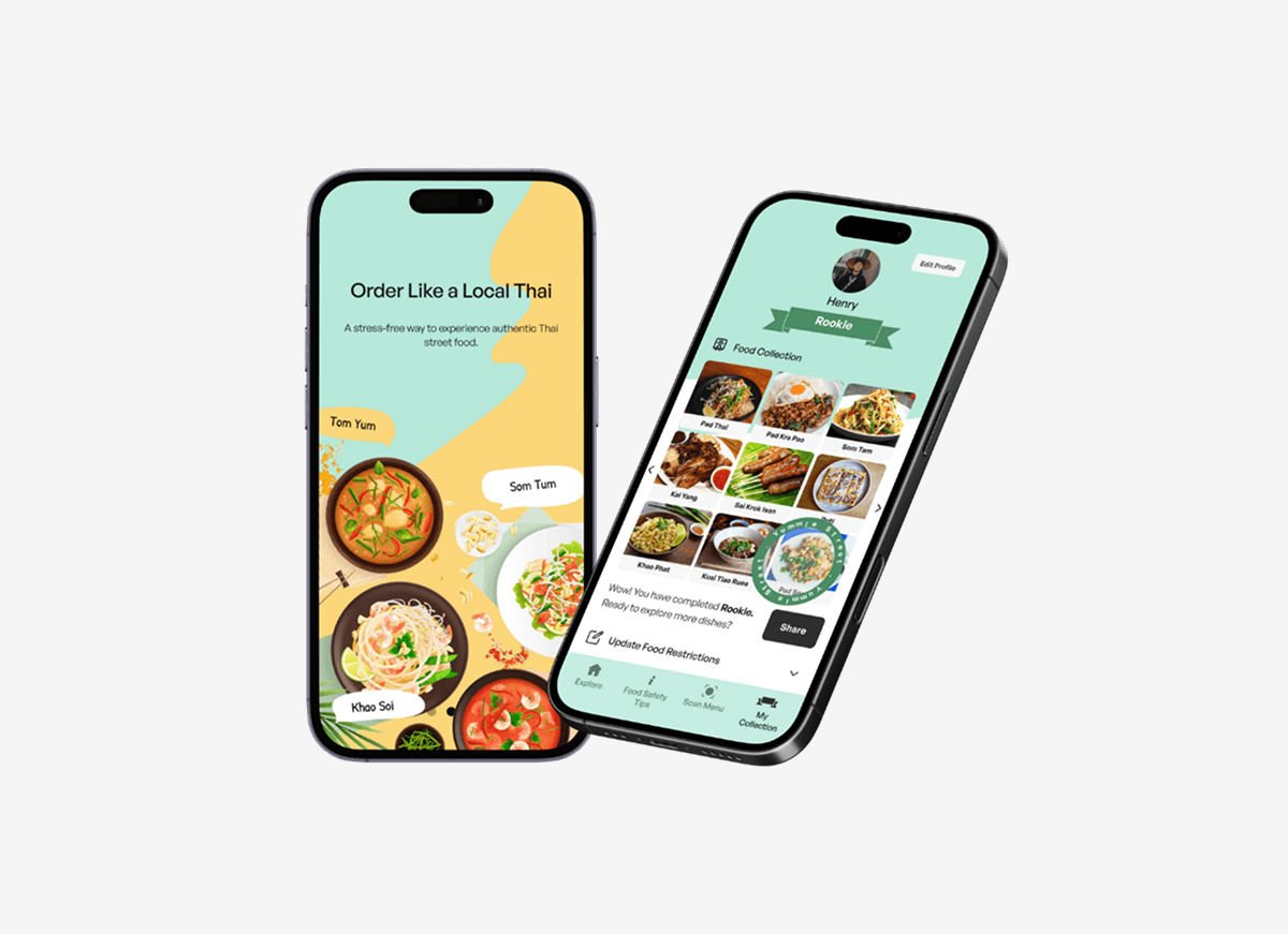
YummieStreets
Easing barriers for backpackers to enjoy street food in Thailand
UX . Research . UT . Food Ordering
A Thai foodie friend in your pocket, guiding to eat street food safely to enjoy authentic taste and stretch budget.